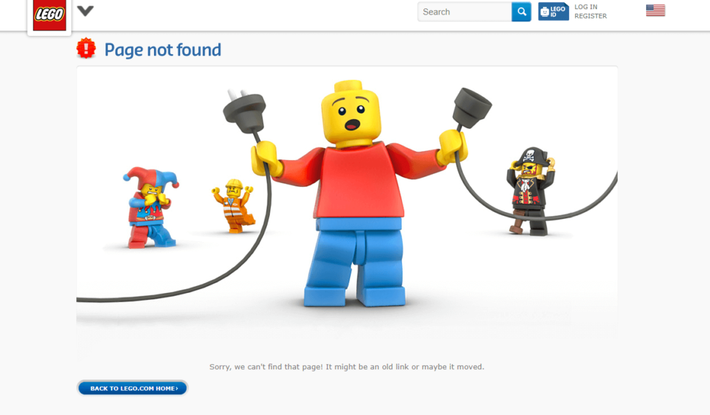
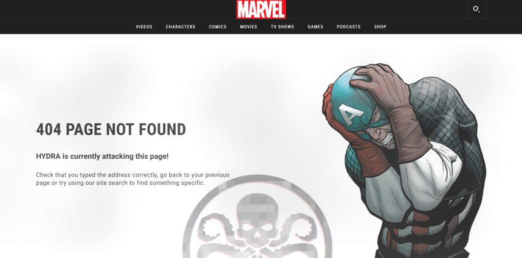
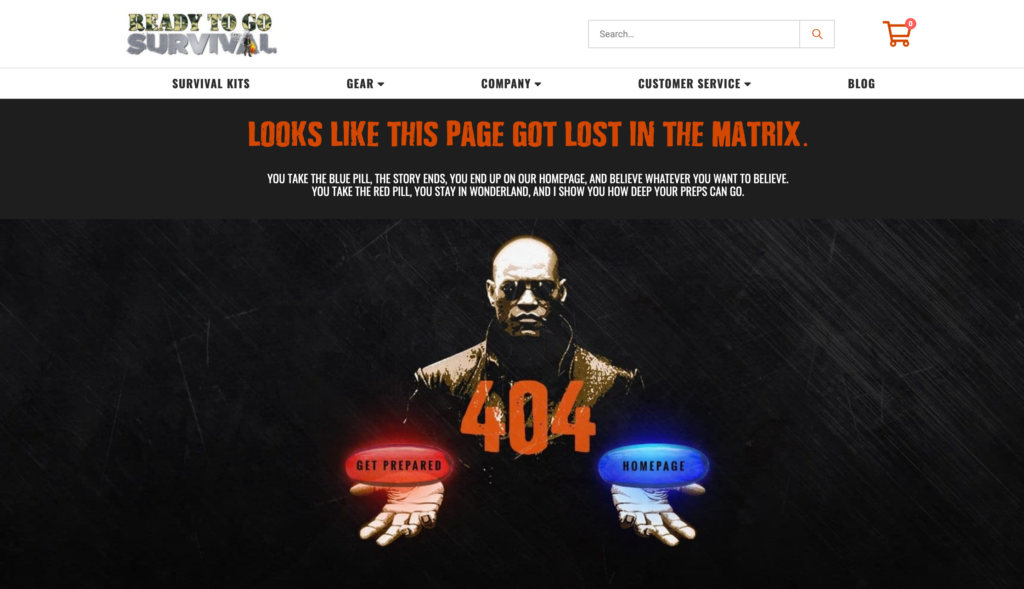
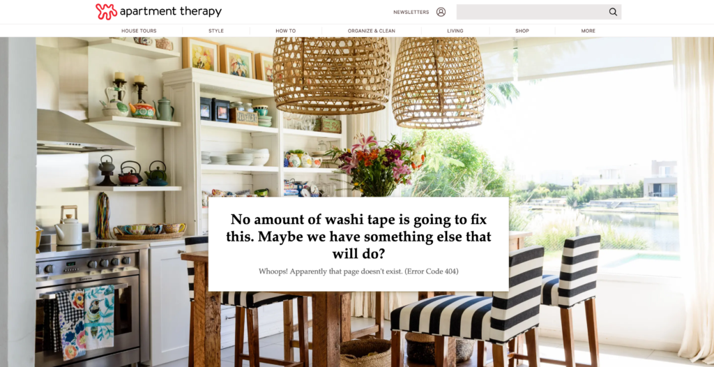
Okay, let’s start with the obvious. No one likes clicking on a link only to find it broken. And where do they end up? Well, hopefully they end up on a clever and at least punny 404 page that softens the blow and gives them alternative options!
And that’s what this post is all about!
We’re going to cover WHAT YOUR 404 PAGE MUST HAVE and I’ll show you some awesome inspiration for your own 404 page.
WHAT SHOULD A 404 PAGE HAVE?
1 ) A navigation menu! This is obvious, but you’d be shocked how often they don’t.
2) A great one-liner. This is your moment; can you get them to give you another chance? Humor or sincerity is your best chance.
How to do it:
Use personal language, and even better – write your 404 page from your brand voice.
When in doubt, just make sure you actually sound like one real person talking to another real person. That applies to ANYTHING you write, from a newsletter to your 404 page.
Here are a few ideas for humanizing your 404 one-liner:
- “Oops! Something went wrong.”
- “Oh shoot! What you’re looking for isn’t here anymore.”
- “Ummm, this is awkward, but we can’t find what you’re looking for.”
3) If you have search capability, include a search bar. Maybe they’ll be able to find what they came for.
4) Give them alternatives! “We can’t find what you’re looking for, maybe this will help:” and then add buttons.
https://www.anthropologie.com/404
5) And finally, make sure it’s SUPER obvious where they are! The cardinal sin when it comes to website functionality is making the viewer do the thinking. That’s your job! So, make sure it’s clear they’ve landed on a 404 page and that you claim responsibility. After all, it’s not their fault you’ve got bad links floating around the interwebs. And by you, I mean all of us! Which is why I have a 404 page too.

you said: