As a brand and website designer, my goal is to chameleon myself into my client’s ideal client and then help them design their business branding and web presence in a way that drams dream clients in and leaves them wanting to stay forever. Patterns, fonts… They all play into this, but so does COLOR! Do you know what your brand colors are saying about you? Time to find out.
Branding is so much fun! Building your Brand Pinterest Board, playing with type sets and patterns, choosing colors… I’m like my youngest when I let him inside a Lolli & Pops candy store (who has a stunning brand and web presence btw).
But it can’t just be about what you as the business owner likes – the most powerful brands know to also include their dream client and how she’ll perceive it into the decision making process. So, today we’re going to talk about color perceptions.
Every hue in the color spectrum evokes and brings to mind different emotions and unique personality attributes, this is referred to as Color Psychology.
Choosing a primary color for your brand identity can signify as much as a pattern or icon that you may have chosen for your logo and or brand. Perhaps you’ve already established your brand or maybe you’re just in the process of designing it, either way, it’s good to have an understanding of what your color choices are saying about you and your business. After some research, I found an article about color meaning from Color Wheel Pro that I’ll be using to help give a brief description of each color family. If you would like further explanation I found this website very informative too!
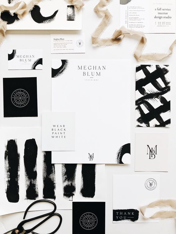
(Black & White Source)
Black is a mysterious color associated with fear and the unknown (black holes). It usually has a negative connotation (blacklist, black humor, ‘black death’). Black denotes strength and authority; it is considered to be a very formal, elegant, and prestigious color (black tie, black Mercedes). In heraldry, black is the symbol of grief. Black gives the feeling of perspective and depth, but a black background diminishes readability. A black suit or dress can make you look thinner. When designing for a gallery of art or photography, you can use a black or gray background to make the other colors stand out. Black contrasts well with bright colors.” – Color Wheel Pro
Black Attributes: Elegance, Formality, Power, Mystery and Death
 White is associated with light, goodness, innocence, purity, and virginity. It is considered to be the color of perfection. White means safety, purity, and cleanliness. As opposed to black, white usually has a positive connotation. White can represent a successful beginning. In heraldry, white depicts faith and purity. In advertising, white is associated with coolness and cleanliness because it’s the color of snow. You can use white to suggest simplicity in high-tech products.” – Color Wheel Pro
White Attributes: Light, Goodness, Cleanliness, Simplicity, Purity.
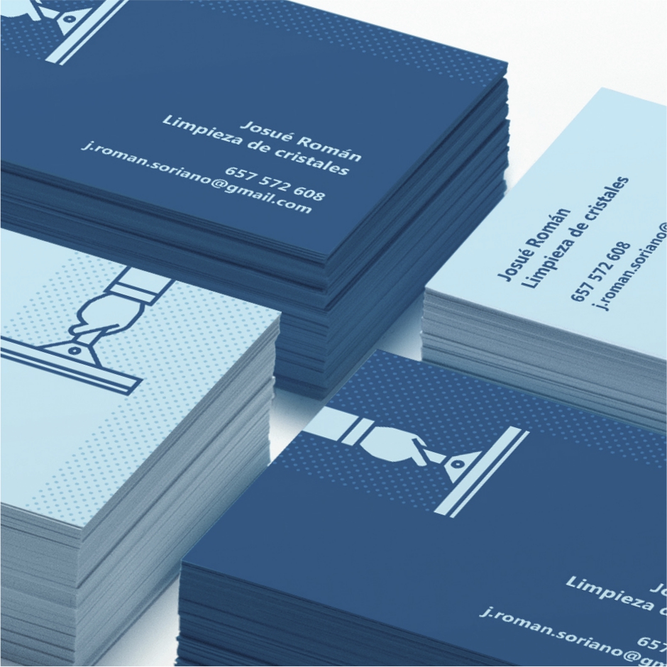
(blue source)
Blue is the color of the sky and sea. It is often associated with depth and stability. Blue is considered beneficial to the mind and body. It slows human metabolism and produces a calming effect. Blue is strongly associated with tranquility and calmness. In heraldry, blue is used to symbolize piety and sincerity. Blue is a masculine color; according to studies, it is highly accepted among males. Dark blue is associated with depth, expertise, and stability; it is a preferred color for corporate America”. -CWP
Blue Attributes: Health, Understanding, Truth, and Softness as well as Power, Intelligence, Integrity, Authority, Seriousness, and Confidence.
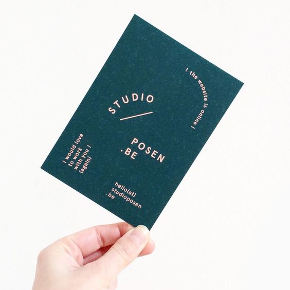
(Teal: Brand Design by me [Leah Remillet] for Jennifer Markoff)
Turquoise {or teal} helps to open the lines of communication between the heart and the spoken word. It presents as a friendly and happy color enjoying life. In color psychology, the color turquoise controls and heals the emotions creating emotional balance and stability. In the process, it can appear to be on an emotional roller coaster, up and down, until it balances itself. Turquoise heightens levels of creativity and sensitivity.” – Judy
Robin’s Egg Blue, or even better known as Tiffany Blue has been so well branded and recognized for the high-quality jewelry store that the color has actually been patented and named respectively in the color spectrum.
Teal Attributes: Clarity, Idealism, Balance, Creativity, Compassion, Self-Sufficiency.
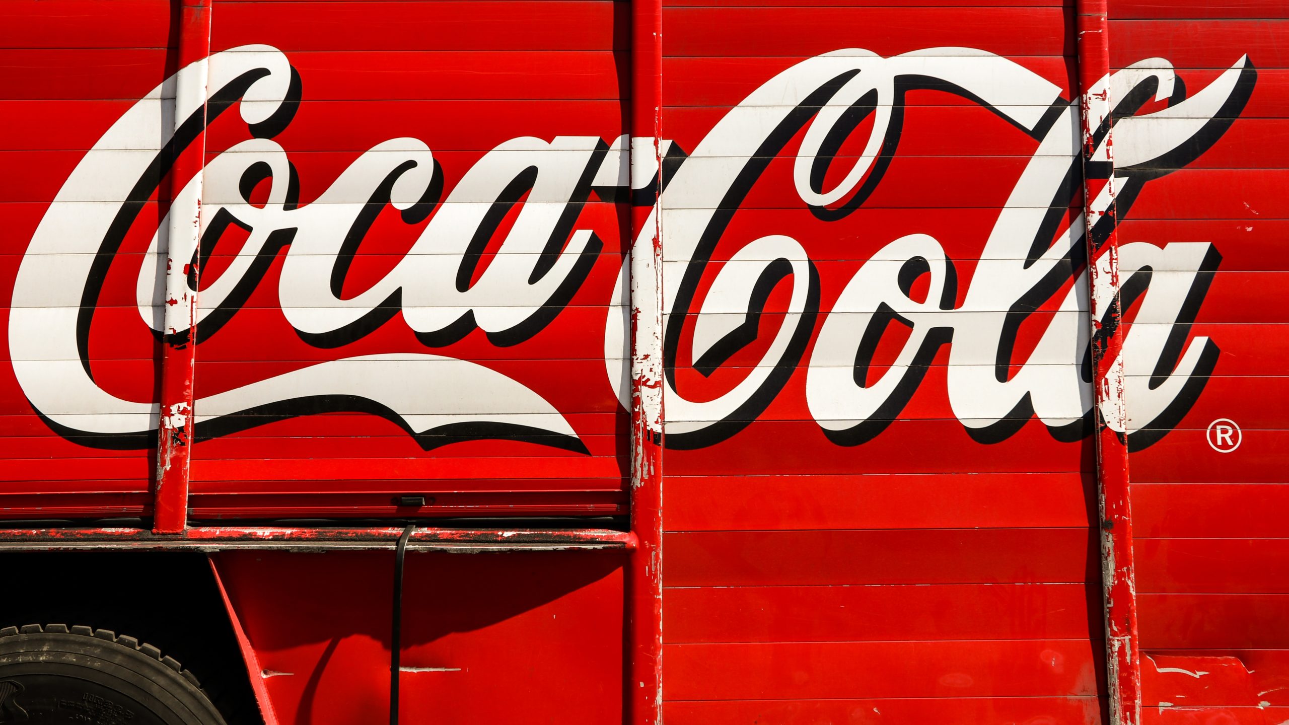
(Red: Who doesn’t think of one of the most recognizable brands of all time, Coca-Cola!)
“Red is the color of fire and blood, so it is associated with energy, war, danger, strength, power, determination as well as passion, desire, and love. Red is a very emotionally intense color. It enhances human metabolism, increases respiration rate, and raises blood pressure. It has very high visibility, which is why stop signs, stoplights, and fire equipment are usually painted red. In heraldry, red is used to indicate courage. It is a color found in many national flags.
Red brings text and images to the foreground. Use it as an accent color to stimulate people to make quick decisions; it is a perfect color for ‘Buy Now’ or ‘Click Here’ buttons on Internet banners and websites. In advertising, red is often used to evoke erotic feelings (red lips, red nails, red-light districts, ‘Lady in Red’, etc). Red is widely used to indicate danger (high voltage signs, traffic lights). This color is also commonly associated with energy, so you can use it when promoting energy drinks, games, cars, items related to sports and high physical activity.” – Color Wheel Pro
Red Attributes: Power, Love, Passion, Potency, Energy, Desire, Action, Determination and Courage.
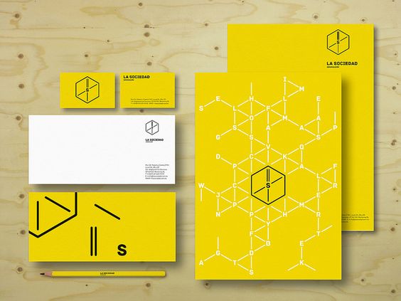
(Yellow Source)
“Yellow is the color of sunshine. It’s associated with joy, happiness, intellect, and energy. Yellow produces a warming effect, arouses cheerfulness, stimulates mental activity, and generates muscle energy. Yellow is often associated with food. Bright, pure yellow is an attention-getter, which is the reason taxicabs are painted this color. When overused, yellow may have a disturbing effect; it is known that babies cry more in yellow rooms. Yellow is seen before other colors when placed against black; this combination is often used to issue a warning. In heraldry, yellow indicates honor and loyalty. Later the meaning of yellow was connected with cowardice. Use yellow to evoke pleasant, cheerful feelings.” – Color Wheel Pro
Yellow Attributes: Energy, Sunshine, Joy, Warmth, Caution, Vision, Intellect, Creativity and Light.
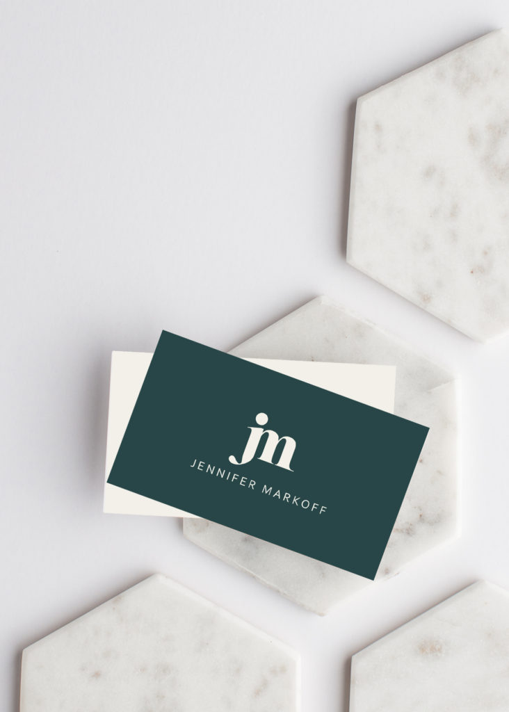
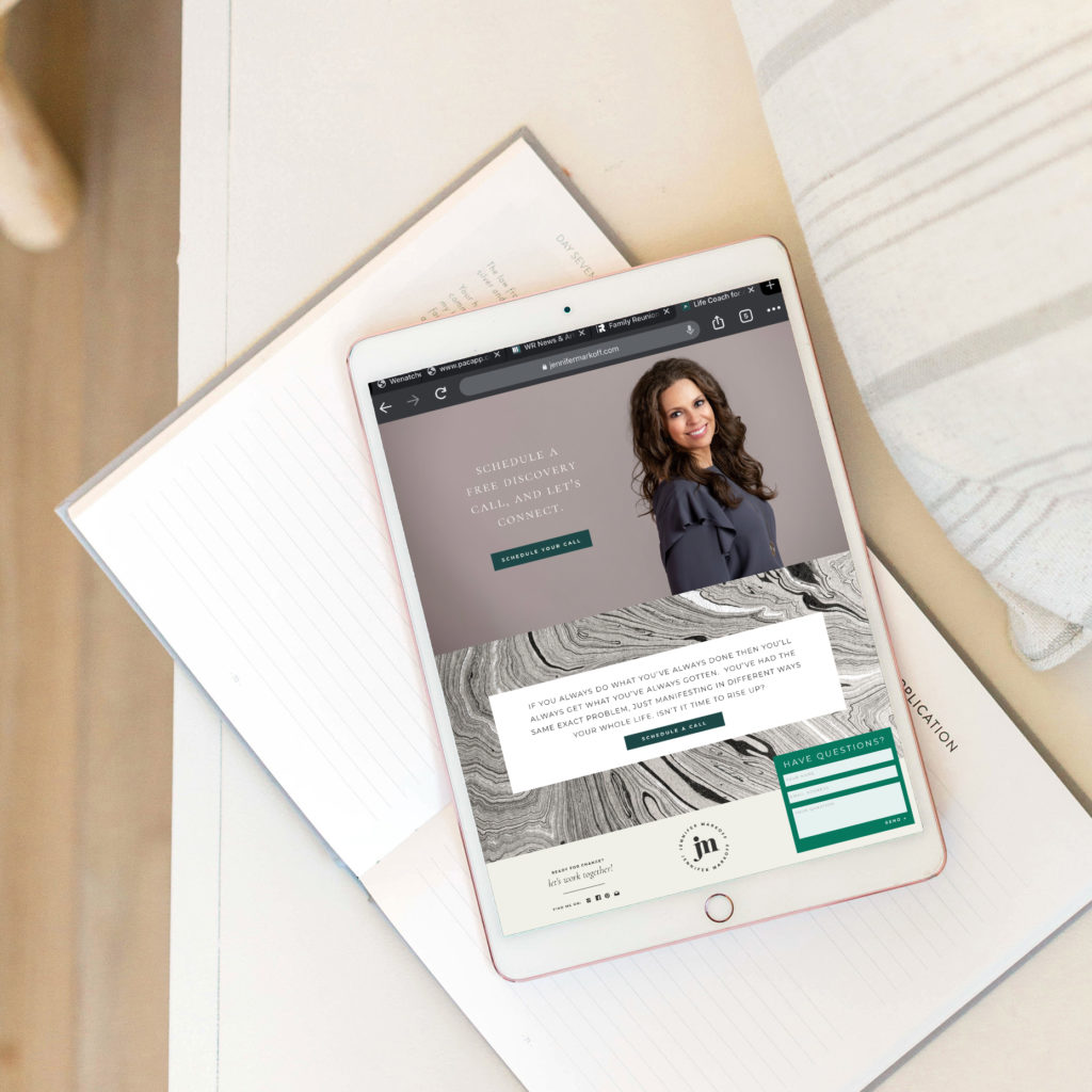
(Green – this is brand and website design I did for Jennifer Markoff)
“Green is the color of nature. It symbolizes growth, harmony, freshness, and fertility. Green has strong emotional correspondence with safety. Dark green is also commonly associated with money. Green has great healing power. It is the most restful color for the human eye; it can improve vision. Green suggests stability and endurance. Sometimes green denotes lack of experience; for example, a ‘greenhorn’ is a novice. In heraldry, green indicates growth and hope. Green, as opposed to red, means safety; it is the color of free passage in road traffic.” – Color Wheel Pro
Green Attributes: Ambition: Growth, Nature, Optimism, Spring, Relaxation, Youth, Luck, Environment, Healing and Wealth.
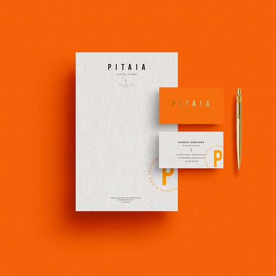
(Orange Source)
“Orange combines the energy of red and the happiness of yellow. It is associated with joy, sunshine, and the tropics. Orange represents enthusiasm, fascination, happiness, creativity, determination, attraction, success, encouragement, and stimulation. To the human eye, orange is a very hot color, so it gives the sensation of heat. Nevertheless, orange is not as aggressive as red. Orange increases oxygen supply to the brain, produces an invigorating effect and stimulates mental activity. It is highly accepted among young people. As a citrus color, orange is associated with healthy food and stimulates the appetite. Orange is the color of fall and harvest. In heraldry, orange is symbolic of strength and endurance.” – Color Wheel Pro
Orange Attributes: Energy, Determination, Encouragement, Potency, Success, Competition, Productivity, Strength, Enthusiasm and Creativity.
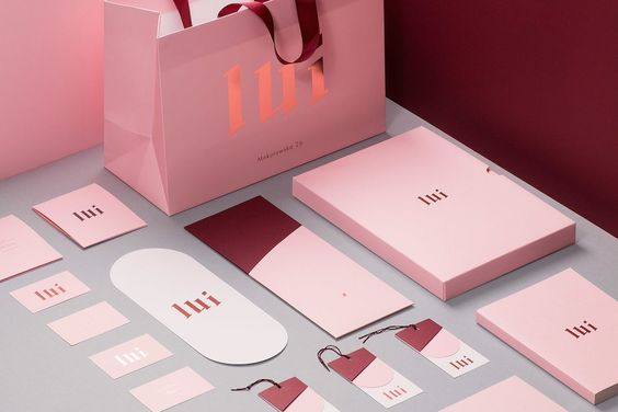
(Pink Source)
“Pink signifies romance, love, and friendship. It denotes feminine qualities and passiveness.” – Color Wheel Pro Pink is the picture of femininity, little girls and newborn daughters. Pink is thought to have a calming effect on people but research has shown that this is only temporary. Sports teams have even gone so far as to paint the opposing teams locker room pink with the idea that it might make their rival opponents less aggressive. “Pink is intuitive and insightful, showing tenderness and kindness with its empathy and sensitivity. In color psychology, pink is a sign of hope. It is a positive color inspiring warm and comforting feelings, a sense that everything will be okay.” –Judy of empower yourself with color
Pink Attributes: Passion, Love, Calmness, Femininity, Compassion and Reassurance.
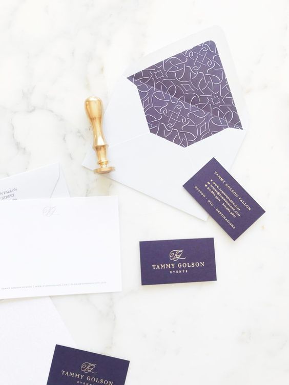
(Purple Source)
“Purple combines the stability of blue and the energy of red. Purple is associated with royalty. It symbolizes power, nobility, luxury, and ambition. It conveys wealth and extravagance. Purple is associated with wisdom, dignity, independence, creativity, mystery, and magic. According to surveys, almost 75 percent of pre-adolescent children prefer purple to all other colors. Purple is a very rare color in nature; some people consider it to be artificial.” – Color Wheel Pro
Purple Attributes: Royalty, Ambition, Wealth, Nostalgic, Mystery, Spirituality, Mysticism, Inspiration, Magic, Dignity and Luxury
Are you ready to refine or design your brand board?
Want some Brand Board Inspiration?
Here is my daughter Ella’s Brand Board and her Etsy shop.
And here is my Brand Board and my website.
I’d love for you to leave a comment and tell me…
What color is your business?
Why did you choose that color?
For Leah Remillet Photography I chose Mustard Yellow. I wanted to choose Yellow because my dad’s company which I worked at for 4 years and am still the Vice President of today is all branded in YELLOW. My dad is my super hero and my biggest fan in the world, it was important to me that part of him be represented in my business because he is why I am. His Yellow however is bright sunshine yellow which is great in the marine world but did not send the right message for me so I varied it up to mustard yellow which sends a more sophisticated dramatic vibe. I decided to pair the mustard with dark brown and craft so that it would give a more contemporary feel. I’m very drawn to mustard yellow which made it very easy to take the color and run with it through out everything…. And I mean everything! My wardrobe, my office, my decor and my business.
Just look at my pinterest board… I’m VERY drawn to the color! http://pinterest.com/leahremillet/leah-remillet-branding-inspiration/
Ever since I was apart of your Branding Webinar a few weeks back (with the yellow striped socks) everytime I see Mustard Yellow, I currently think of you! 🙂
Ahhh I love it! Huge Grin!!
The colors of my business are Black & Hot Pink. I think the “Hot Pink” draws a very different reaction than soft pink. I chose those colors for many reasons: first because I rarely see a photographer with those brand colors. Second because it’s BOLD and memorable. Third because I personally love those colors together and often wear those colors and they fit very naturally into my life and attitude. My photography style is very un-traditional, different and bold so those colors went perfectly with the statement I want to give about my business. Plus they’re fun and girly!
I couldn’t agree more! That’s why picked them too! To me, black and hot pink are edgy and energetic with a touch of femininity.
I love this! And who knew that the colors I picked really do say a lot about what I was trying to convey to my clients! I guess we’re all drawn to certain colors for a reason 🙂 Great post Leah!
When I started my business, I started with red and black because I thought it was a classic color combination that would work well with the style I had at the time. I did mostly weddings and adult portraits when I started, and this color scheme worked. But, over the years, I have transitioned into doing seniors, newborns/children and families, more than weddings and adults, so I needed a change. I am rebranding right now to a more fun, light color palette of aqua blue, chocolate brown & white. I think it fits much better with my current client base and the way my style of photography has evolved.
My colors are teal-ish, white, gray/black (I say gray/black because I go back and forth depending on the day). I choose teal because I just love the color…it was my primary wedding color, it’s all over the house, it’s the main color in my closet…it’s just everywhere! So it was an obvious choice for my business. From the post and reading about the colors, I definately am happy with my choice and hope my branding conveys: friendly, happy, healing, elegant, cleanliness, and maybe if I’m lucky I’ll look thiner! 😉
My colors are light blue, bright blue and silver. Blue has been my favorite color since I can remember, and it is so easy for me to run with it. I also love pink, so there is little bits of pink thrown in here and there too. I thought about doing some sort of teal too, but I know a lot of photogs use it, and I wanted to be different.
This was really cool to see all of the different colors and their meanings. It sorta makes me want to add royal purple into the mix, but I won’t. I really like my blue.
I agree! It’s really fun to see what each color means and it does make you think about adding other colors for their meanings.
Dark Yellow can mean sickly… Who wants “sickly” in a portrait? All the same i’m owning it!
My colors are limish green, grey and white.Everytime I see anything in this color palette I think of something clean and fresh and spaish. I wanted my pictures, website and blog to look clutterless and these colors coordinated with that feeling i wanted perfectly. I always wanted a “logo” but have just maintained the name of my business as my logo. I use the colors for packaging and throughout all printed press, business cards, blog, website. Everything. The colors have become synonymous with my ” brand” and people in my community are beginning to recognize my look. The biggest compliment I get is when someone says my pictures look so “clean”. That’s exactly what I’ve been shooting for.:)
When I rebranded last year, I knew I wanted something that was soft, natural and organic. I went with a green/blue/cream/brown and absolutely love it! Here’s hoping it brings me stability, growth and lots of luck! Lol!
And that is the MOST important thing… to be able to say that you “absolutely love it”. Because YOU and are your brand!
My colors are hot pink and slate grey. I didn’t want to go with black because I associate those 2 colors with sexy, boudoir type images. I do that type of photography, but not primarily. I wanted to go grey, because it’s a little softer and the hot pink gives it a “pop” without being too girly and soft. I do feel like I need a third color though, just not yet sure what I want.
GREEN – I love everything green, why wouldn’t I pick it for my own photography business. What’s even more great is that I just officially started my business when I branded last year. Growth, Ambition, yes! 🙂
My colors are purple and teal! I really chose those colors because they are my favorites, no big thought process going on there :).
I went with classic black and white because I think it is elegant and classy. It can also be edgy. It allows me to throw in a dash of color (usually purple because it’s my favorite!) every once in a while, without throwing off my “brand”. I use black boxes, white labels with black printing and then a ribbon of whatever color I am in the mood for! If it’s a wedding, I use their wedding colors for the ribbon, if it’s a senior I try to coordinate with what they were wearing, if it’s around Christmas I will use red, gold or silver. I just can’t decide on ONE color, so this way, I can use them all!!
I chose teal/aqua, organe and white. I just love how clean white looks and how great the other two colors come together and pop against it.
Every time i put together a package with these colors it just makes me smile! and hope my clients feel the same way when they open it!
I just changed my logo. It was my red and gray signature and kind of formal, and that is so NOT me or the fun direction I want my business to grow. My new logo is green, red, pink, and turquoise. Much more fun!
I chose brown and pink because I love the color combo and it works well with my logo, a plumeria & bamboo. I wanted to stick to the japanese origin that the name came from and wanted it to represent it’s translation. I also though of my packaging when I chose colors too!
i am gray. dark and light. and white. hummmmm 🙂 this was fun! thanks!
I chose a dark olive-y green color, chocolate brown, a beige/cream color & white. My business name is Green Tree Media so I always knew I wanted to use a “tree-like” palette. This color combination has always been my favorite. It’s calming, relaxing, & has always made me think of growth. I want people to feel relaxed & comfortable around me so I feel like it carries over in that way too. & I’m always wearing some combination of those colors too! This was a great post Leah! Thanks for sharing! It’s fun seeing everyone’s answers.
Thanks Stephanie! Always feel free to make suggestions if you think something would be a particularly fun topic.
choosing the colors for my business was such a process. i started with red and then added cream for a elegant ‘champagne and strawberries’ feel. but it felt too elegant so i changed the red to purple to retain the elegance but add some vibrancy. But still I wanted something elegant but more stylish with out becoming trendy. That’s when i got rid of the cream and went with silver/grey. Now with my purple and gray i have a stylish yet elegant look that i love! I love what the description above says “the stability of blue combined with the energy of red’ its perfect for my line. the stability and classicism of the silver paired with the energy and love of the photos <3
DUDE! I think we were on the same brain wave with color and branding. Just rebranded with LOTS of colors and I’m FINALLY happy. I’m not 100% done but go check it out. I had this inner turmoil of trying to be colorful for family and kids and yet be classy for brides and weddings. This is what I’ve come up with so far. 🙂
I have gone with hot pink, grey and black. I started out trying to go with something a little more laid back, nearly had my entire branding finished…and just hated it. I was drawn to pink…always have been and went with black and grey because of the beautiful contrast. When I develope my marketing a bit more I would like to pair the pink with white for my baby and newborn clientel. I am quite happy with what I have chosen and although I see a lot of ladies have chosen the same colours, there arn’t any who have gone that direction in my area. My very very remote rural area. Lol. It stands out here, that’s for sure!
Great article. Sounds like I made some good color choices. What you had to say about orange was reassuring, I had bedn a bit nervous about using orange in the header bar.
Im all about clean and sleek… with a twist of sass!!! It took me a while to really connect with my own sense of style and how to fuse it into my brand as well as my work. Most of my marketing material is grey and white but im slowly incorporating a touch of mustardish yellow. I love how my brand doesnt overpower my images but just compliments them. For me black was to harsh so grey was a softer choice and white…. I LOVE white!!! Most of my yellow is in the form of a damask print which hopefully adds the little bit of spunk that I was going for.
Thanks for your post as always they are very helpful and get my wheels turnen’!!!
Just looked at your blog… Say mustard yellow and I just HAVE to peak… Super cute!!
My logo color isn’t on your list! Go figure.
The primary color used in my logo is a rich brown. I chose to use this because my business appeals to the nostalgic side of photography, and I designed my logo and website so that it would create such feelings. My goal was to give the overall impression of thumbing through a beloved family scrapbook.
Great post…even though my color wasn’t listed 😀
WW
well, I was looking for brown! lol
Hi Leah,
I am a still photographer and am designing my stationary comprising of visiting card, a letter head, envelope and a website. Can I use a combination of colours Turquoise and black for my stationary? As in Turquoise being the base or background colour and black for my logo and other details. Can you please guide me…..?
Hi Kunal,
You could absolutely do teal and black, think how good Tiffany & Co. makes it look! I think the real key is going to be in finding the right hue for your teal. The hue you choose will say a lot about your brand… If it’s bright, it’s going to scream children’s. My favorite combo is a soft muted with a charcoal grey that is almost black. I like the sophisticated vibe it has! Check out the background of the Tiffany website color to see the saturation I’m referring to: http://www.tiffany.com
I hope that helps! Feel free to upload the color palette you’re thinking of to the Go4Pro Photos Facebook wall if you’d like some feedback. 🙂
[…] For picking out the right combination of colors, I recommend using Colour Lovers and Coolors. Also, this resource is great for deciphering what certain colors say about your […]
I chose Teal as part of my brand because my best friend died of Ovarian cancer and my aunt recently went into remission from the same cancer. Teal is the awareness color for Ovarian cancer.I also love the color teal because it, to me, says young and fun. I also chose metallic gold because I wanted my brand to say luxury and high class. i am a senior portrait photographer.
Love it Mary. And so awesome that there is so much meaning and significance behind your choices.
You should make this post like into a definitive guide or something. I bet a lot of your new readers that come to this site would want to be able to find this post. It’s too good to keep secret!
[…] colour variation, and in some cases look almost medicinal. Teal is also a commonly used colour. In colour psychology, teal evokes the feeling of calm, balance, but also professionalism and trust. Therefore these shampoo designs convey to the reader that their hair is in good […]
Thank you for sharing your insights. I completely concur with your points and value your clarity on the subject. Creators like you elevate the educational experience, making it a blissful endeavor for learners across the globe.